October 28, 2021 — Amber Last modified on November 01, 2021

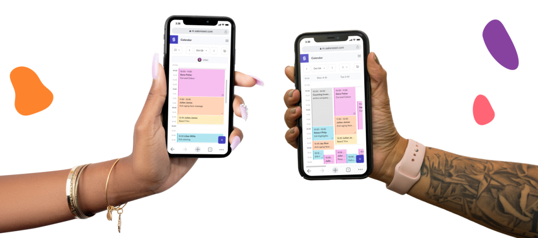
A mobile experience that makes it easier to view, create and modify your appointments.
When we started Salonized, most of our users used the calendar, register and customer management on devices with a big screen, such as a computer or laptop. But the use of Salonized on mobile has grown more prominent in recent years once smartphones got more powerful. You are simply not always in the salon when you want to view your schedule, create a new appointment or when a customer calls to reschedule.
That is why the demand for a mobile app grew. That’s not a surprise, because we saw that mainly the desktop version of Salonized was used on mobile. Our previous mobile version only contained two features: the calendar and the customer base. So people went for the desktop version.
However, a zoomed-out version of software with so many features simply does not work well. That’s why we’ve been working on a better mobile experience for the past year. Today, all features can be used on mobile, such as the calendar and the customer base, as well as the cash register, the feedback system and product management. And we are happy to introduce the new mobile version of Salonized to you in this blog post!
We will kick off with a before & after photo of this cosmetic procedure and will show you the most important icon when you are using Salonized on mobile, namely the icon which brings you to the new mobile version of Salonized.
Within the new design, we also have a New Calendar experience, made for different types of professionals and adapted to your everyday routine from the feedback we received from you. When creating the new calendar we thought about the different needs you may have when using it on your computer, your tablet, but also on your phone. That is what I’m going to show you now!
Using the calendar when you work alone
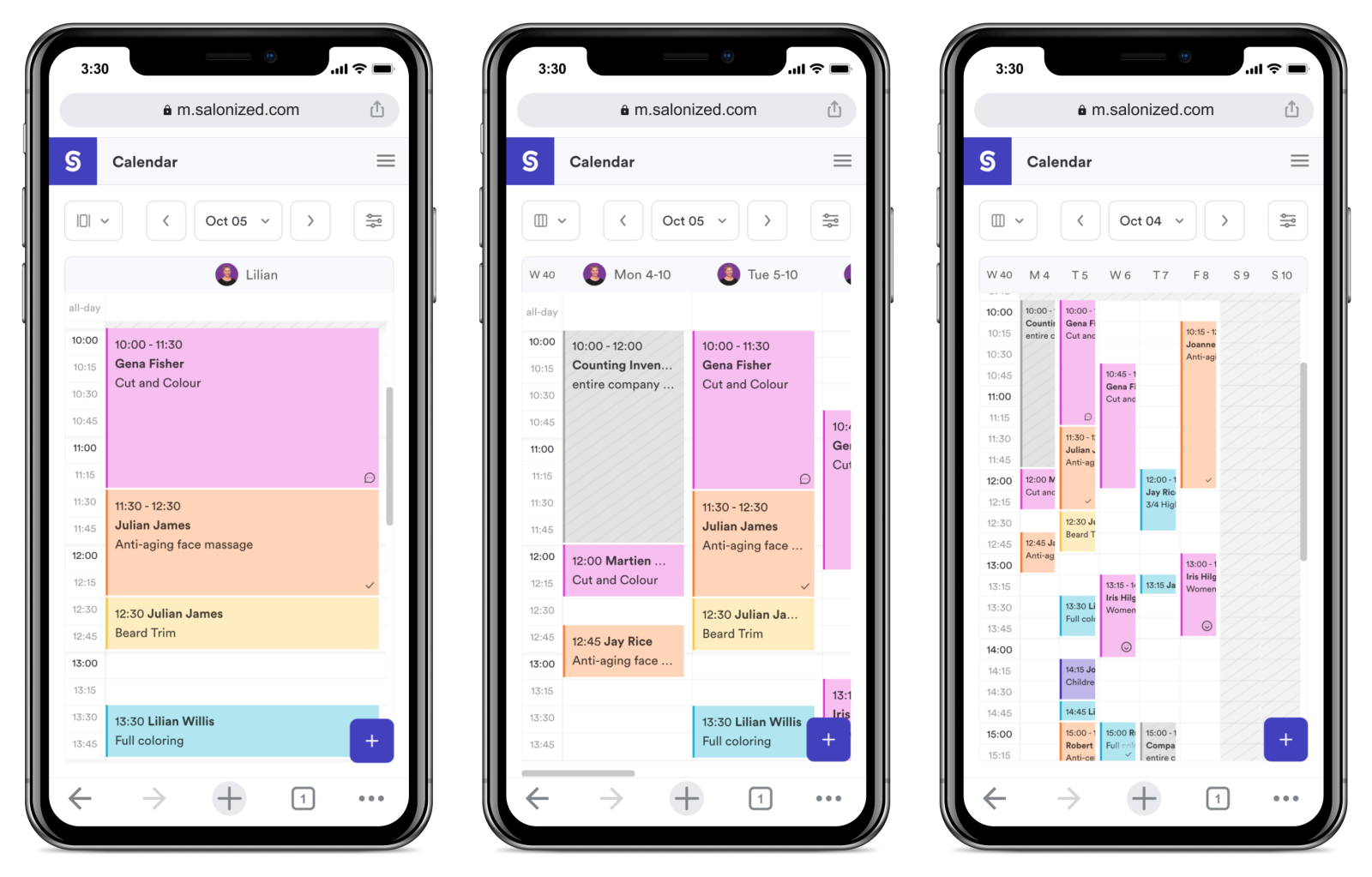
When the calendar is all yours it gets very simple. You don’t need to filter a lot because everything there is yours, that’s why the filters appear differently for you. The highlighted filter is the one you can use to switch your calendar view. By clicking on the first option on the top left of your calendar you can change to daily view, week view or weekly overview.

Using the calendar when working with colleagues
If you share the calendar with colleagues your calendar will adapt to it. In this case, there are different people using the same agenda to check their own appointments. Keeping that in mind, we’ve made the access to the employee filter easier. This way you can easily switch between employees’ calendars to check what you need.
Of course, you can always see all employees at the same time in the agenda, but since mobiles are small devices, it makes it easier when you have it filtered so you can focus on specific appointments. You can still change the view of your calendar and also filter per treatment room and equipment if you have those. You can find this inside the filter button, placed on the top right.

Checking the schedule of the Day:
The best way to check what you need to do in a day, is to select the calendar view by day. This way, you have a clear and clean view of your appointments, at what time they’re scheduled, the customers you will be treating and the services to be performed. If your calendar has other colleagues, you can also select yourself to only see your own appointments.
Checking the schedule of the Week:
If you prefer to have a look at your weekly schedule, you can select the week view. This way, you can see more than one day per scroll, in a faster way. Again, if desired, you can also filter the employees you want, to focus on their tasks.
Checking the overview of your weekly availability:
This is a new feature that we made specifically for mobile. We know that sometimes it’s necessary to see the bigger picture of your weekly schedule to understand how full it is and how much availability you still have. The weekly overview offers you this.
Of course, in this view you have less visibility of the details, because it is not possible to show everything at the same time. If you need to check any details, simply click on the appointment you wish to see to view more, click on one of the days above the calendar or change the view to daily or weekly.

Have you checked what you need? Now return to the current week or day:
If you are navigating through your calendar to see other days, you can always click on the “today” or “this week” button inside the filters area. This will bring you back to today, if you are using the day view, or to the current week, if you are using the weekly view or weekly overview.

We’ve researched the way appointments are being created by our users. Based on the most common flows, we’ve improved the way you create new appointments. That’s why we have changed the order of the steps inside the form, to name an example.
Service suggestions
To improve the speed at which a new appointment is made, we added a new cool feature: the service suggestions! Now we show you some of the most popular services in your salon for you to add with one click.
No need to search for your most popular services anymore! We also suggest services based on the customer history. If you don’t see this yet, don’t worry, soon it will be available for everybody :)
Employee preference
If there are other colleagues in the same calendar, you can choose the employee. You can also select the employee first, but by choosing the service before, you can see which employee is available that can perform that service.
If the employee is not available you will see a warning to be aware of overbookings. You either save it anyway, choose another employee or find availability.

Appointment suggestions with one click
The ‘find availability’ button shows you the available times that an employee has to help a customer for the selected service. So when a customer calls to book a new appointment but your calendar is quite full, the ‘find availability’ button helps you to suggest some appointment possibilities to the customer.
Easily manage recurring appointments
If it’s a recurring appointment, you can already create a sequence for your customer by simply creating the first appointment that needs to recur. Depending on the service, you can create a daily, weekly, or monthly recurring appointment. You choose what fits your customer best.

Important customer information at a glance
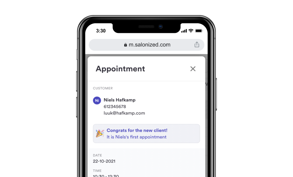
When adding a customer now you have more information right away! You will be able to see the last time this customer has been in your salon, or if the customer has no previous appointment, you will see that it is a new customer!

When clicking on an appointment in your calendar, you can see more information attached to this appointment. If you work with multiple colleagues, rooms or equipment in your calendar, first you will see a popover with the most important information of this appointment.
We’ve made this to provide easier and more filtered information about the appointment: customer name, service and the assigned employee. You can also see the most common actions you can perform in an appointment: edit, report and checkout. You can always see the full information of the appointment by clicking on the more-button. If it’s a recurring appointment, you can easily reschedule if the time is not convenient.
Is there anything else that you think would be handy to see in this popover? Let us know in this form, so we can keep improving it.

If you work alone you won’t see the popover because your calendar is already simple enough on the appointment details page itself. On this page, the first thing you see is your customer information and the new feature that shows you if it’s a new customer or if it’s an existing customer. In the latter case, you can see when their last visit to your salon was.

If you don’t see the updated version you might be using the desktop version of the calendar on your phone. That is not ideal, because the mobile version has been made specifically to use on a phone, with the right design and interactions to make everything easier to use.
For now, we let everybody also opt for the desktop version just to give you time to get used to the new way, but in the near future only the mobile version will be available.
Using a desktop version on mobile also affects the sensibility of the screen, since the system thinks you are using a mouse device that works very differently from a touchscreen. You can switch to the mobile version by clicking on the small mobile icon in the purple bar on the left, above the settings icon. You might need to click twice until it changes, because as this has not been made for mobile, sometimes the system may understand that it’s a mouse hovering over the icon and not a click.
Do you like the new calendar? Is there something you think we can improve? Is there anything in the desktop version that you miss in the mobile version? Let us know in the chat!
✨ Thanks for reading! ✨


We call Amber ‘Miss Salonized’. This is because she has held a number of different functions within the business and she knows all the secrets of the salon software system and more! All her experience has made her the perfect candidate for her current role as Product Manager, keeping you informed of all the latest Salonized developments.

Advanced yet easy. Extensive and flexible. Salonized is designed for teams and for individuals.
Get started No credit card required